The RunMags user interface is designed for consistency, making it easy to navigate the various functions.
RunMags is designed with usability and a great user experience in mind. Although the system has many different functionalities, the user interface maintains the same consistent look whether you're in sales, production or finance.
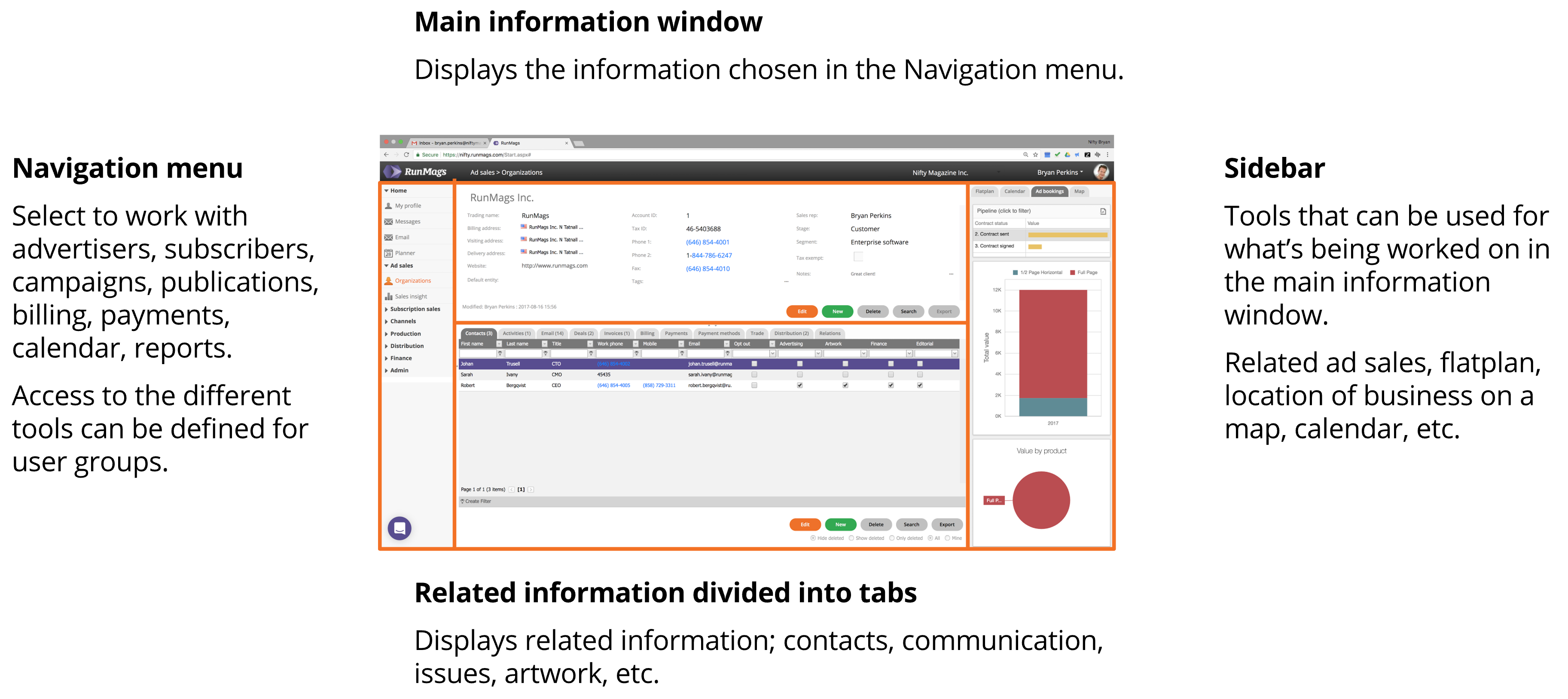
The interface is divided into five main areas:
The top bar holds the RunMags logo, information on where the user works in the system and the right-hand menu for accessing profile, company and account settings.
The navigation menu is to the left for navigating between the available tools.
The main information window is in the top centre, where specific contexts like a client, a contract or a magazine are located. The final two areas display information related to the main information window.
The related information window (divided into tabs) is located at the bottom centre where related information to what's in the context in the central information window is displayed, for example, contacts related to a client company.
The sidebar window to the right contains related information to what's in context but can also be manipulated in real time. For example, if a client company is located in context, then a meeting booked in the calendar in the context menu will be related to that client company.
Most windows in RunMags can be expanded to simplify usage on tablets and even phones. At each border between the five main areas above, small triangles can be clicked to minimize a specific area.